ChartAccent - LineChart
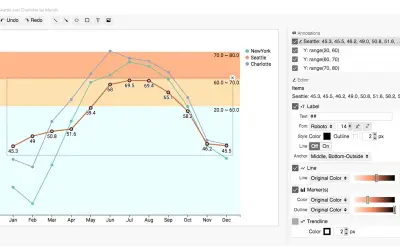
ChartAccent - LineChart is an open source tool for creating annotated line charts by highlighting data points and series.
Donghao RenPaidCompare
2531 analytics apps for Microsoft 365
ChartAccent - LineChart is an open source tool for creating annotated line charts by highlighting data points and series.
Donghao Ren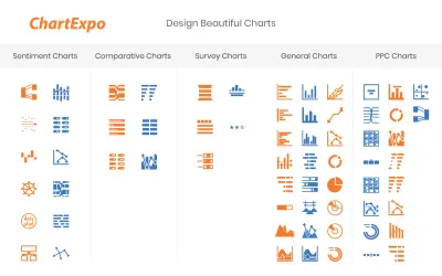
ChartExpo for Excel is a data visualization add-in that generates custom charts from spreadsheets using a three-click process.
polyvista.com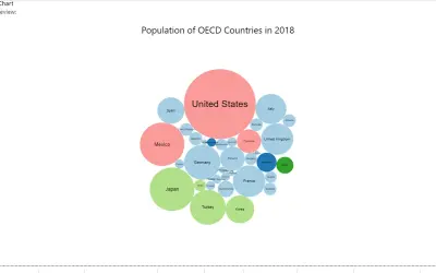
Displays ready chart templates built with the original Charticulator or Editor visual inside Microsoft Power BI reports.
Ilfat Galiev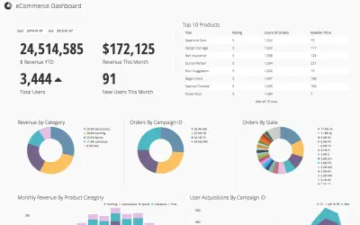
Chartio is a cloud-based analytics tool that lets teams access, explore, transform, and visualize data from SQL databases.
Chartio
A Power BI plugin that lets developers embed AI agents so report users can query their data in natural language.
Chartenza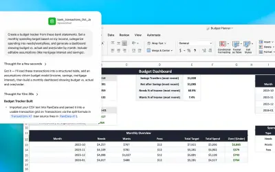
GLM for Excel and PowerPoint builds spreadsheets, analyzes data, creates slides, and edits decks from the Office Add-in sidebar.
OpenAI, LLC
ChatGridAI answers internal questions in Microsoft Teams using uploaded company documents scoped by department.
Baltic AI Solutions
CheckVentory Auditor reconciles 100% of assets across multiple locations for the funded vehicle inventory sector.
CheckVentory Innovation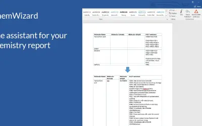
An add-in that completes report tables with PubChem data and translates H & P identifiers into their statement text.
Bernhard Webstudio
Button-based slicer for Power BI that can be arranged horizontally or as a matrix, with cross highlighting and image support.
Microsoft Corporation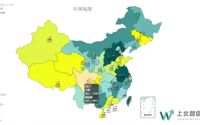
China Color Map provides offline China and provincial maps with one-click switching, drill-down, and color-shaded value display.
北京上北智信科技有限公司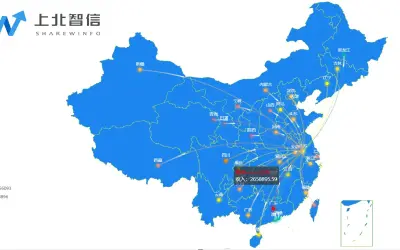
China Flow Map provides offline map rendering, one-click national or provincial switching, and visual configuration for reports.
北京上北智信科技有限公司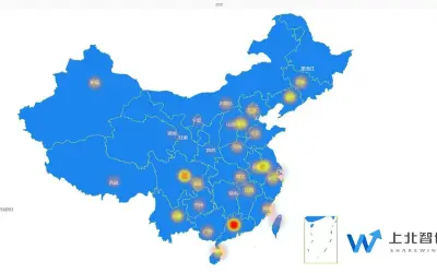
China Heat Map visualizes the regional distribution of data across China, with darker colors indicating larger data volumes.
北京上北智信科技有限公司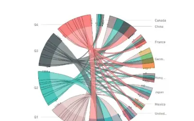
An open source Power BI visual that displays inter-relationships between entities using arcs or Bézier curves.
Microsoft Corporation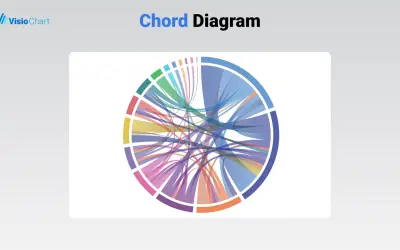
The Chord Diagram by VisioChart depicts data relationships as chords on a circular layout for Microsoft Power BI.
VisioChart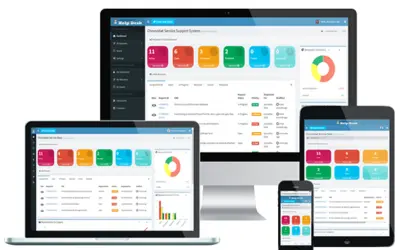
Chronodat Help Desk add-in lets teams create, assign, and track support requests to closure, with dashboards and a request board.
Chronodat LLC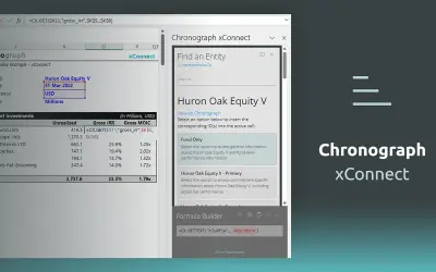
Chronograph xConnectJS provides an interface to search investment entities and attributes within Excel for Chronograph clients.
Chronograph
CI Tracker tracks and manages lean and six sigma continuous improvement initiatives on a centralized web-based platform.
OPS FOCUS Inc.
Ciao provides voice and video calls, screen sharing, group chat, and PSTN outbound calling for team collaboration across devices.
DotConnect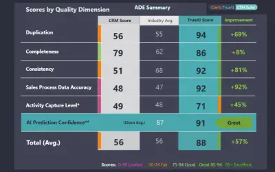
TrueAI GTM Suite MM Annual Subscription delivers CRM data augmentation and operational analysis for mid-market go-to-market teams.
Cien Global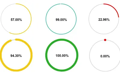
Circle KPI Gauge represents the percentage of data for each KPI as a donut chart consisting of an outer and an inner ring.
Paypal_ITA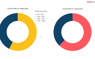
Circular Gauge by MAQ Software displays actual values or percentages against targets in pie or donut chart formats for Power BI.
MAQ LLC