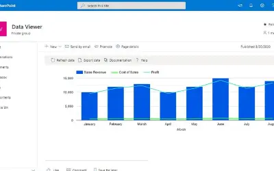
Lightning Tools Data Viewer
Lightning Tools Data Viewer lets SharePoint and Teams users build data views and charts from multiple sources without code.
Lightning ToolsPrice not published
Adds a categorical bubble chart visual for Microsoft Power BI with analytics, formatting, labels, and small multiples.
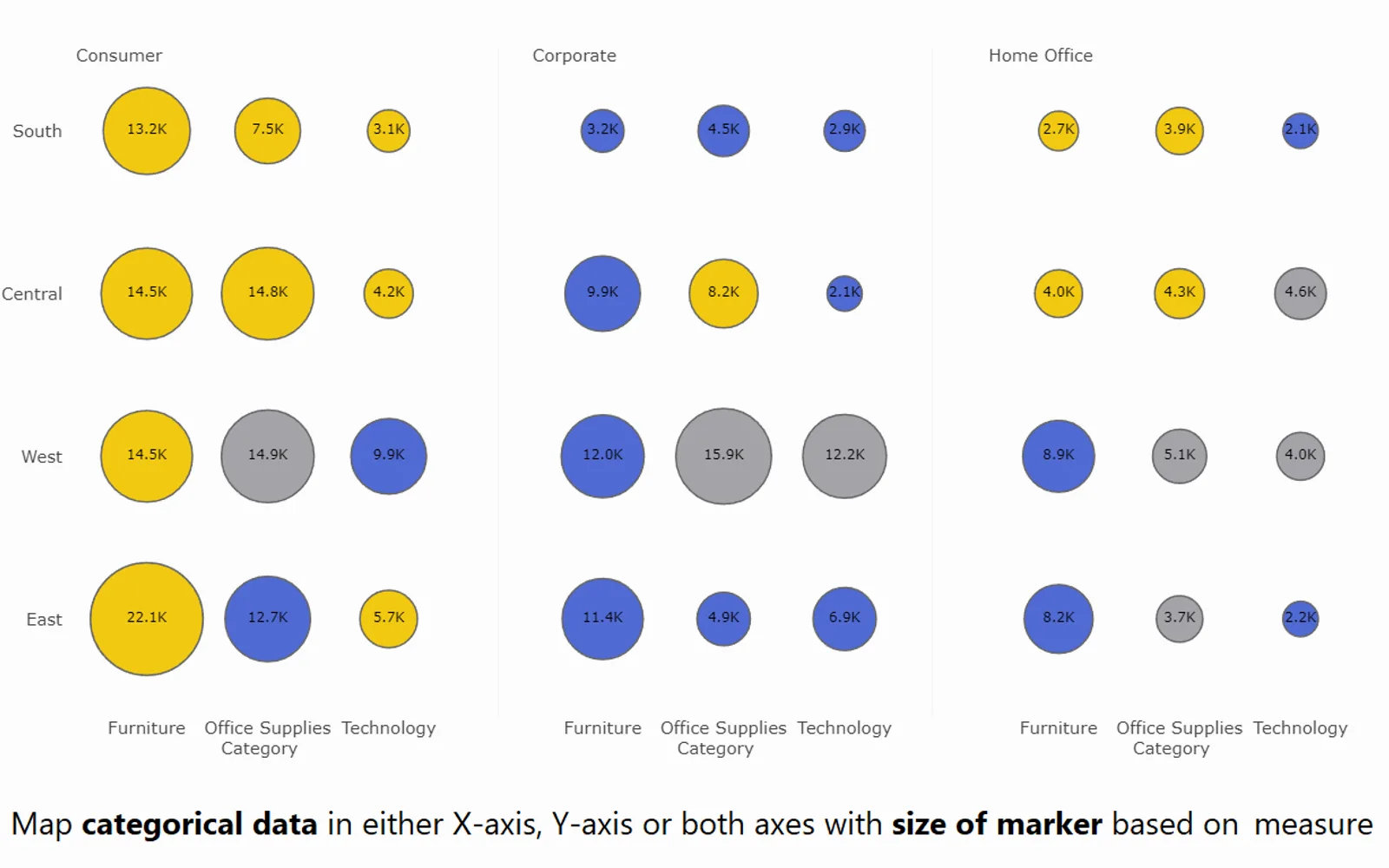
Adds a bubble chart visual for categorical data in Microsoft Power BI. It supports small multiples, reference lines and bands, error bars and bands, conditional colors, and customizable bubble properties. Custom label formatting, tooltip pages, and drill down are supported. The visual does not access external services or resources.
Supports small multiple and trellis layouts.
Includes reference lines and bands, error bars, and error bands.
Supports conditional color formatting.
Allows changes to bubble transparency, size, shapes, outline color, and outline thickness.
Supports custom label formatting.
Supports tooltip pages and drill down.
Lightning Tools Data Viewer has an unknown pricing model, while this listing has a paid pricing model. Lollipop Column Chart and Bullet Chart - xViz have freemium pricing models, while this listing has a paid pricing model. Multi Line Chart with Tooltips also has a paid pricing model, while Ridgeline Plot by Powerviz is free. All listed alternatives and this listing use cloud deployment.
| Name | Pricing | Deployment | Updated |
|---|---|---|---|
| this plugin | Paid | Cloud | |
| Lightning Tools Data Viewer | Price not published | Cloud | |
| Lollipop Column Chart | Freemium | Cloud | |
| Bullet Chart - xViz | Freemium | Cloud | |
| Multi Line Chart with Tooltips | Paid | Cloud | |
| Ridgeline Plot by Powerviz | Free | Cloud |
877 plugins in Power BI · Analytics
Price distribution: 74 free, 113 freemium, 497 paid, 193 price not published
Lightning Tools Data Viewer lets SharePoint and Teams users build data views and charts from multiple sources without code.
Lightning Tools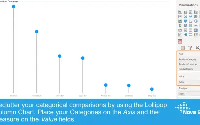
Lollipop Column Chart displays a marker and line per category as an alternative to standard column charts in Power BI.
Nova Silva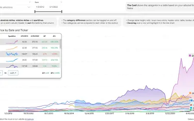
Power BI visual that compares categories over time, with YoY, MoM, YTD and MTD calculations, deltas and sparklines.
Datanauts
Power BI visual for comparing actuals against targets, with IBCS-certified bullet chart templates and comparison bands.
xViz LLC dba Lumel«This visual is not certified by Microsoft Power BI team. If you want the certified version of this visual, please check Bubble Chart with Categorical Data (Pro). Please note all our Pro visuals can be exported to PPT/PDF. All of our visuals, including those not certified by Microsoft, do not access any external …»