
Power Plot Visual by Akvelon
Creates visualizations from diverse chart types, combines multiple charts on one canvas, and adds custom annotations and tooltips.
AkvelonFreemium
Creates repeated line charts in Power BI using shared scales and axes for category comparisons.
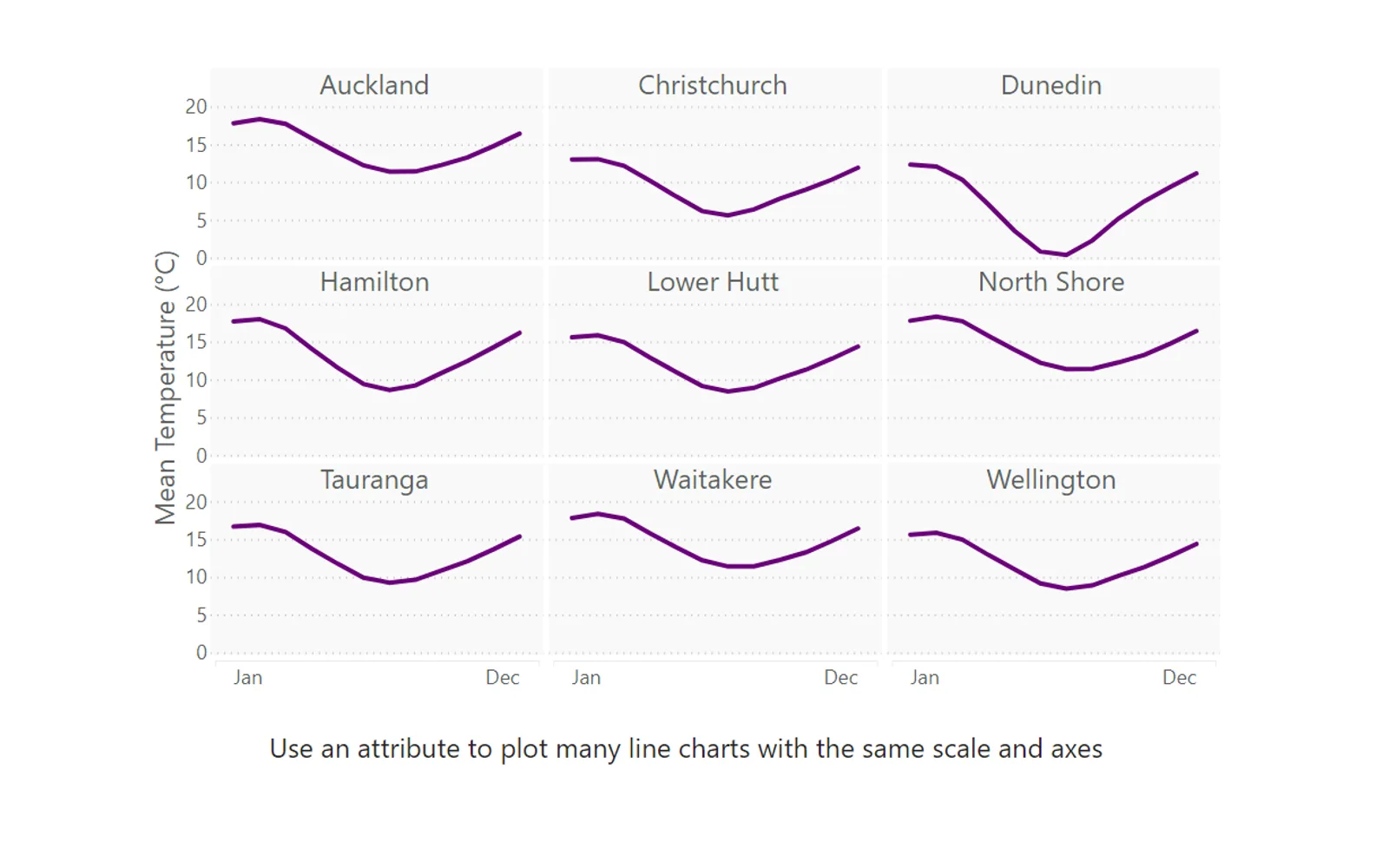
Creates a series of line charts from a measure, with one chart for each value of another category. The charts use the same scale and axes for comparison.
Duplicates a measure normally shown in a line chart for the values of another category.
Uses the same scale and axes across the series of charts.
2,531 plugins in Analytics
Price distribution: 125 free, 147 freemium, 1,350 paid, 909 price not published
Creates visualizations from diverse chart types, combines multiple charts on one canvas, and adds custom annotations and tooltips.
Akvelon
Creates financial and business reports in Power BI with automatic variance calculations, P&L logic, and drill-down (s5, s6).
Zebra BI
COSMO Text Module provides extended text management with a WYSIWYG editor for Microsoft Dynamics 365 Business Central.
COSMO CONSULT
Discover the why behind your data.
Data Courage«A small multiple (also known as a trellis, lattice, panel or grid) is a series of charts using the same scale and axes, allowing them to be easily compared. This visual allows you to take a measure you might normally plot in a line chart, and duplicate this for the values of another category. Refer to the example …»