
Power Plot Visual by Akvelon
Creates visualizations from diverse chart types, combines multiple charts on one canvas, and adds custom annotations and tooltips.
AkvelonFreemium
Displays proportional data as a responsive donut chart with customizable geometry, labels, connectors, and center content.
Displays proportional data in a donut chart with adjustable inner radius and slice spacing. Positions data labels with connectors and supports center content for summary metrics. The visual includes controls for small-multiple layouts, card styling, formatting, tooltips, series, colors, and interactive states.
Customizes the donut chart's inner radius and slice spacing.
Positions data labels and supports connectors between labels and chart slices.
Displays summary metrics in the center of the chart.
Provides layout control for small-multiple charts.
Includes card styling, global formatting, series management, and color management.
Supports native tooltips and interactive states.
2,531 plugins in Analytics
Price distribution: 125 free, 147 freemium, 1,350 paid, 909 price not published
Creates visualizations from diverse chart types, combines multiple charts on one canvas, and adds custom annotations and tooltips.
Akvelon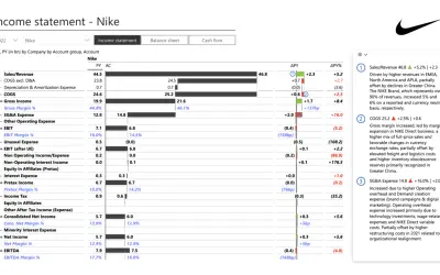
Creates financial and business reports in Power BI with automatic variance calculations, P&L logic, and drill-down (s5, s6).
Zebra BI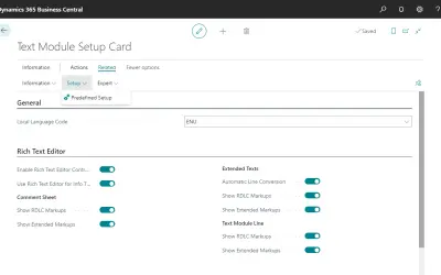
COSMO Text Module provides extended text management with a WYSIWYG editor for Microsoft Dynamics 365 Business Central.
COSMO CONSULT
Discover the why behind your data.
Data Courage«The Donut Chart by r42 offers a modern take on the classic pie chart. With advanced styling options, label connectors, and center content, it provides a clear and attractive way to display proportional data. It features customizable inner radius and slice spacing to match your design needs. The visual includes smart …»